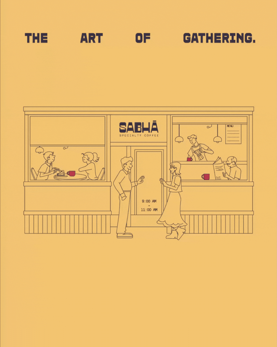
Sabha Speciality Coffee - Hyderabad
- Payal Khemka Bapna
- Mar 10, 2025
- 1 min read

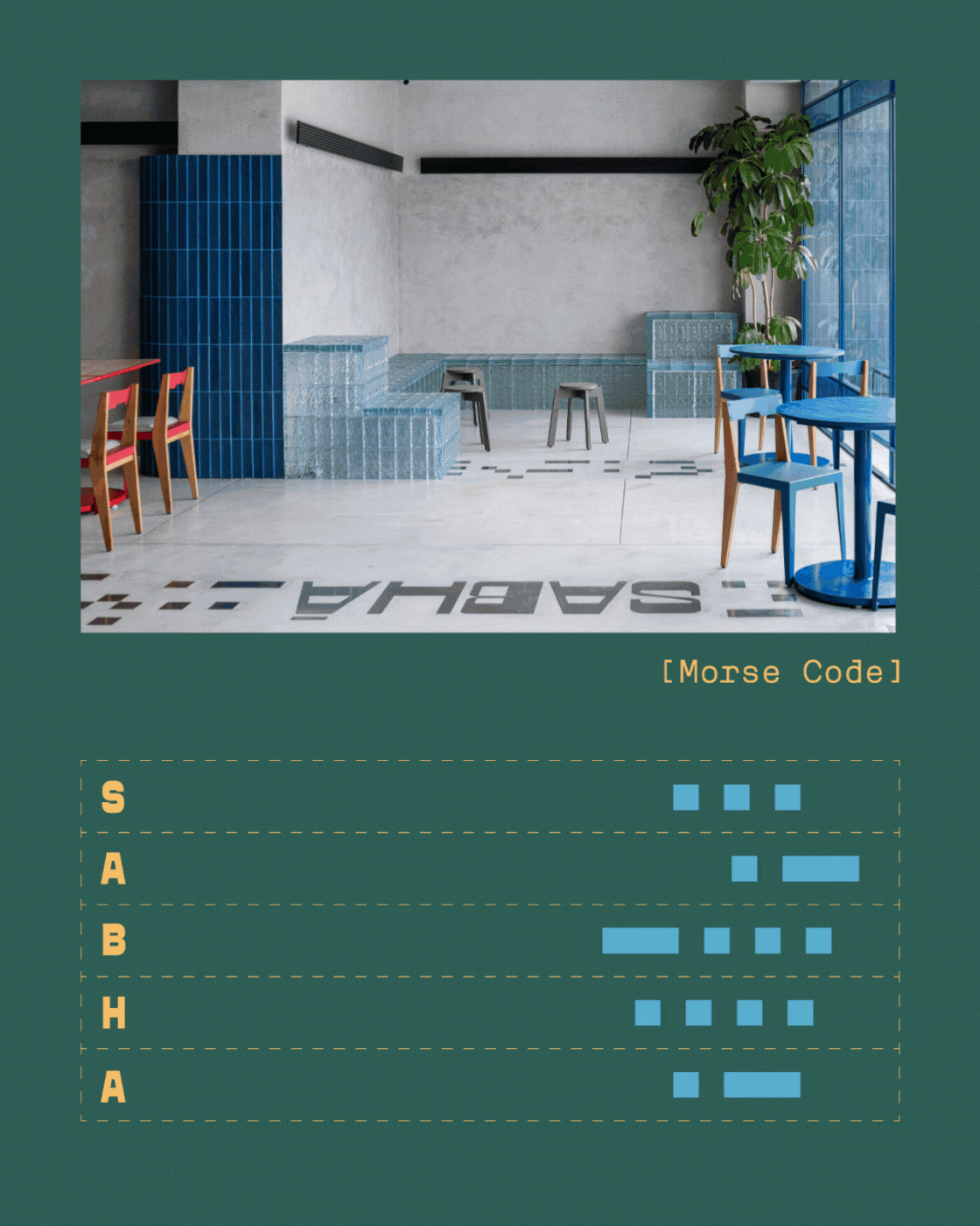
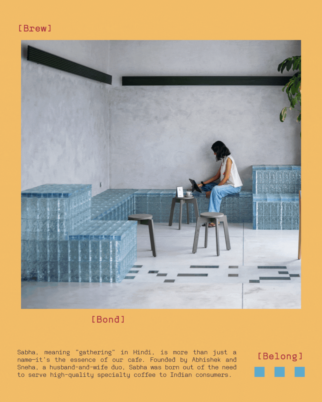
Sabha isn’t just a coffee shop-it’s a modern-day baithak, a space for people to pause, connect, and feel a sense of cultural belonging. The name itself, Sabha (meaning ‘a gathering’ in Hindi), formed the foundation of the brand identity, directing everything from tone to typography to tactility. Set in Jubilee Hills, Hyderabad - an area filled with hyper-modern cafés - Sabha offers a counterpoint: a sophisticated, welcoming space where community and coffee meet with equal intention.


Sabha’s visual identity goes beyond traditional design elements by incorporating Morse code, using the letters "S-A-B-H-A." This subtle yet innovative touch adds depth and personality to the brand, giving a nod to communication and connection-two core values of Sabha.
The Power of Three Dots – Sabha’s “S” Symbol:
In Sabha’s branding, the three dots of Morse code (representing "S") serve as a distinctive signature. This simple yet powerful motif symbolises connection, conversations, and continuity—echoing the spirit of Sabha as a gathering place.